HEALTHCARE · LEGACY MODERNIZATION
Modernizing a healthcare provider platform
Redesigned the medical authorization upload experience for healthcare providers — replacing a legacy system with a structured, validation-driven flow that reduced rework and clarified status.
CONTEXT
The product
- COMPANYRed Ventures Brasil — embedded in Porto Seguro Saúde
- INDUSTRYHealth insurance • Provider operations
- PRODUCTAutorizador — the platform healthcare providers use to submit, batch, and track payment guides (digitação, lots, TISS) for Porto Seguro Saúde reimbursement
- USERSHealthcare providers — clinics, hospitals, and consulting offices — across multiple operational roles
- STAKESProviders depended on this system to get paid for services rendered. Friction in upload meant delayed reimbursement, increased rework, and unclear status on the operations side.
- Role
- Senior Product Designer
- Team
- Design • Product • Porto Seguro process team
- Scope
- Guide payment system — digitação, lots, payment submission, glosa, TISS upload
- Year
- 2021
THE PROBLEM
Where the legacy system was hurting providers
The existing Autorizador worked digitally — but as a fragmented legacy system without proper validation, clear feedback, or synchronous status. Providers spent more time fighting the tool than processing their patients' care.
01
No validation on data entry
The system accepted incorrect guide submissions without flagging errors at the source — errors only surfaced later, generating glosa disputes and forcing providers into rework cycles.
02
Cryptic system feedback
Error and status messages were technical, ambiguous, and hard to act on. Providers couldn't tell what went wrong, where to fix it, or what came next.
03
Asynchronous status, scattered across channels
Parts of the authorization process flowed through email instead of the platform — making real-time status tracking impossible and creating uncertainty around payment timing.
BUSINESS SIGNAL
This wasn't just a UX problem — providers depend on this system to get reimbursed. The problem here translated directly into operational cost for clinics and hospitals, eroding the perceived quality of Porto Seguro's provider service.
MY CONTRIBUTION
What I owned end-to-end
I inherited the Autorizador initiative from my direct lead and led it as the principal designer — responsible for design strategy, system audit, and stakeholder alignment with Porto Seguro's process team
I mapped the existing flow and surfaced where validation, error messaging, and status visibility were failing — translating operational pain into design priorities the Porto team could approve
I redesigned the full guide payment system — guide-by-guide entry (digitação), batching into lots, payment submission, glosa indication for downstream correction, and TISS file upload. The technical rules and validation requirements were owned by the Porto team and partially inherited from the legacy system — my role was interpreting those requirements and designing the UX around them.
PROCESS
How I got there
PHASE 01
System audit
PHASE 02
Design & alignment
PHASE 03
Refinement & handoff
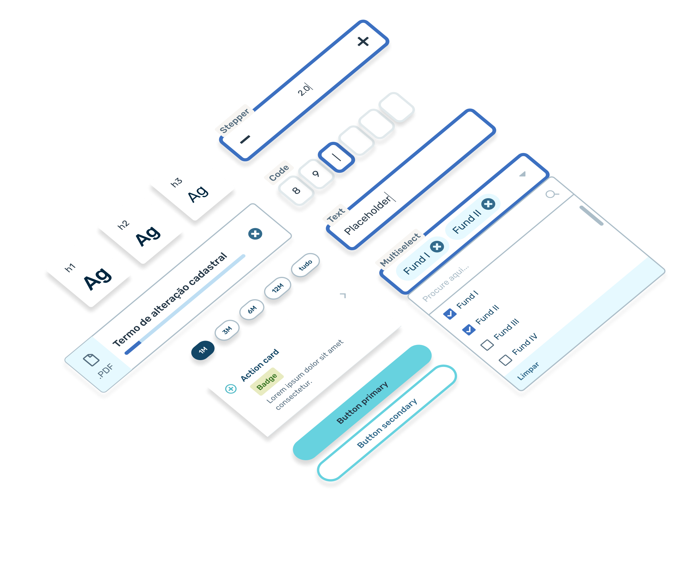
SYSTEM AUDIT
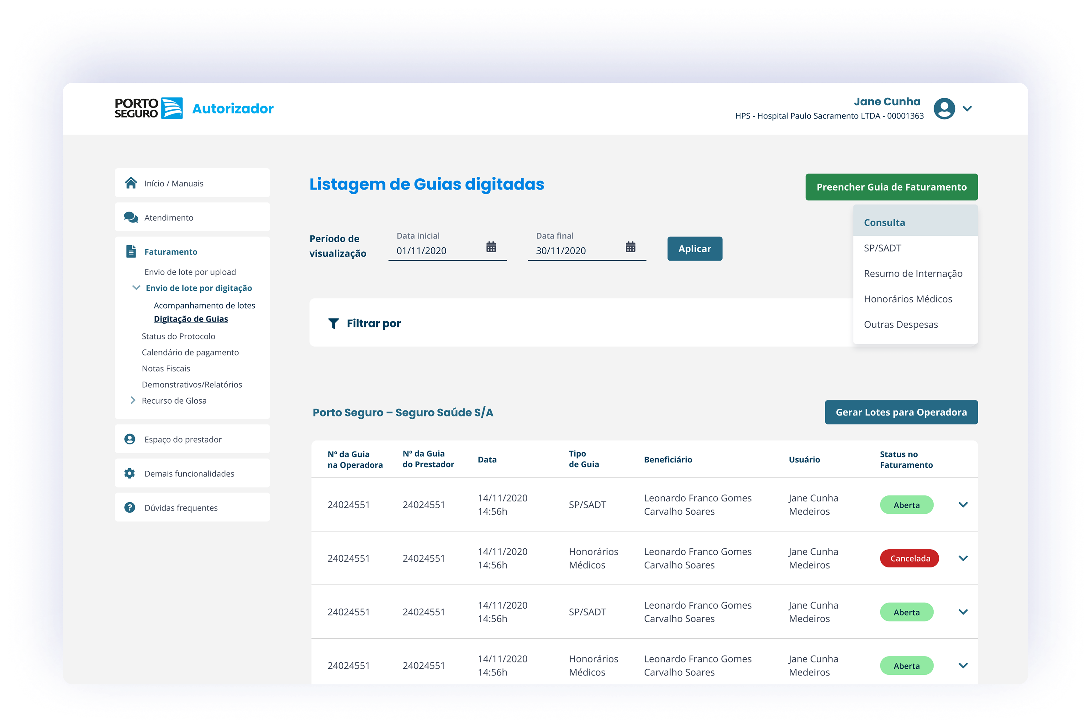
The legacy Autorizador interface — dense, low-contrast, with cryptic error messages and no inline validation. This audit shaped every priority in the redesign.
SOLUTION
Four structural changes that redesigned the experience
| PROBLEM | Structural changes |
|---|---|
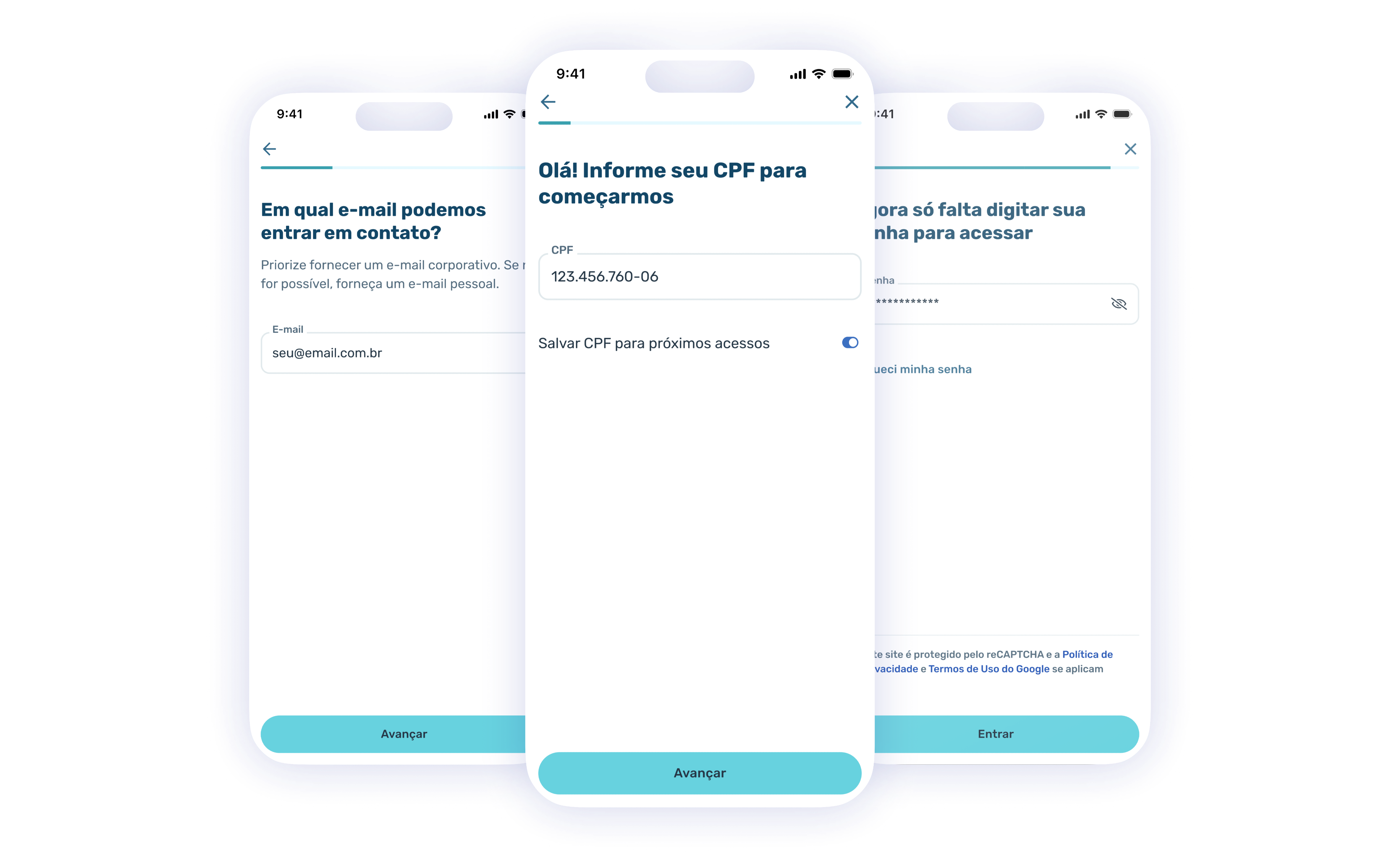
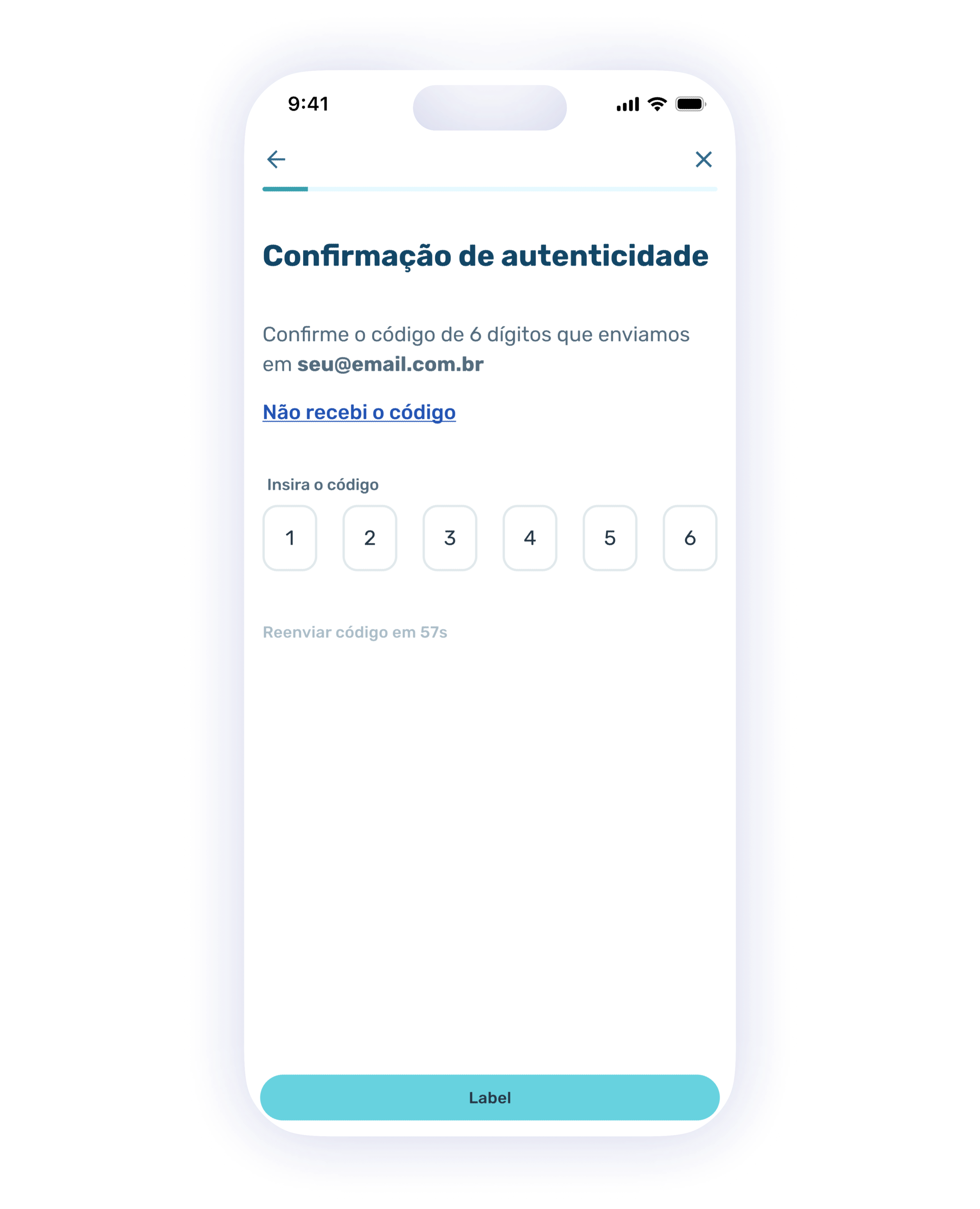
| Errors only surfaced after submission — too late to fix without rework | Inline feedback for Porto's existing validation rules (CPF, CRM, guide numbers) — surfaced at the point of entry instead of after submission, so providers could fix issues without rework. |
| Cryptic feedback left providers stuck | Plain-language errors and status messages designed for the operational reality — what went wrong, where, and what to do next. |
| Lost progress when sessions ended mid-form | Auto-saved drafts on each completed section — providers could close and resume without redoing work, critical for long forms split across shifts. |
| Drastic redesign risked rejecting users | Familiar information groupings preserved, hierarchy strengthened — the redesign read as evolution to the operations team, not replacement. |
BEFORE
Dense legacy layout with cryptic error markup. No inline validation, no progressive disclosure.
AFTER
Same form, restructured into clear sections with progressive disclosure. Pre-validation against Porto's database catches errors before submission.
OUTCOME
What changed for providers
BEFORE
Dense, low-contrast interface from a previous era
Validation errors surfaced only after submission, blocking rework
Cryptic system messages providers couldn't act on
Status scattered between platform and email
AFTER
Clean, structured layout with clear visual hierarchy
Porto's validation rules surfaced inline at point of entry
Plain-language feedback designed for operational clarity
Auto-saved drafts and clearer in-platform status
LEARNINGS
What this taught me
Legacy modernization is as much stakeholder design as it is interface design. Porto's process team feared that drastic change would disrupt the operational reality of providers already trained on the old system. Framing the redesign as evolution — preserving familiar groupings, updating only what was broken — was what made every iteration approvable. Drastic was the wrong ambition; deliberate was.
The most valuable design move on this project wasn't a flow or a component — it was inline and pre-validation against Porto's database. Catching errors at the point of entry, rather than after submission, was what turned the experience from reactive to confident.
Want to dig into the legacy modernization trade-offs or the validation architecture?
Happy to walk through how I navigated rigid stakeholders and inherited an active design initiative.
CONTINUE READING