DESIGN SYSTEMS · RESPONSIVE TYPOGRAPHY
Scaling responsive typography
Rebuilt the design system typography using rem-based tokens and breakpoint variables — replacing a rigid dual-scale architecture with a unified responsive system.
CONTEXT
The system
- CompanyOnze
- ProductMinuto Design System
- ScopeTypography architecture • Token system • Documentation
- UsersDesigners • Front-End Engineers across Onze products
- StakesDual-scale typography was creating duplicated component variants, fragmented documentation, and inconsistent scaling on extreme screens — slowing both design and engineering velocity.
- Role
- Senior Product Designer
- Team
- Design • Front-End Engineering
- Scope
- Design System architecture
- Year
- 2026
THE PROBLEM
Where the dual-scale system fell apart
The Minuto Design System worked for common screen sizes — but the dual-scale typography (mobile + desktop) introduced compounding pain points across the design and engineering workflow.
01
Duplicated component configurations
Components required separate mobile and desktop typography definitions — creating duplication that grew with every new component added to the system.
02
Fragmented documentation
Each component had multiple layout versions to document, splintering the source of truth and making the system harder to maintain.
03
Inconsistent scaling on extreme screens
Typography broke on extreme devices — small phones and ultra-wide monitors — making the product feel unpolished where customers experienced it most.
BUSINESS SIGNAL
Typography breaking on extreme devices made the product feel unpolished — eroding customer trust at the surface they see most. Internally, every new component required parallel mobile and desktop versions, extending documentation time on a team without a dedicated design system function.
MY CONTRIBUTION
What I owned end-to-end
I led the typography initiative end-to-end, partnering closely with Front-End Engineering. The rebuild was part of a continuous-improvement track defined jointly by the Design Team and the Front-End DS Guild — pitched to leadership by our Design Lead, set up to close product quality gaps in the absence of a dedicated DS team.
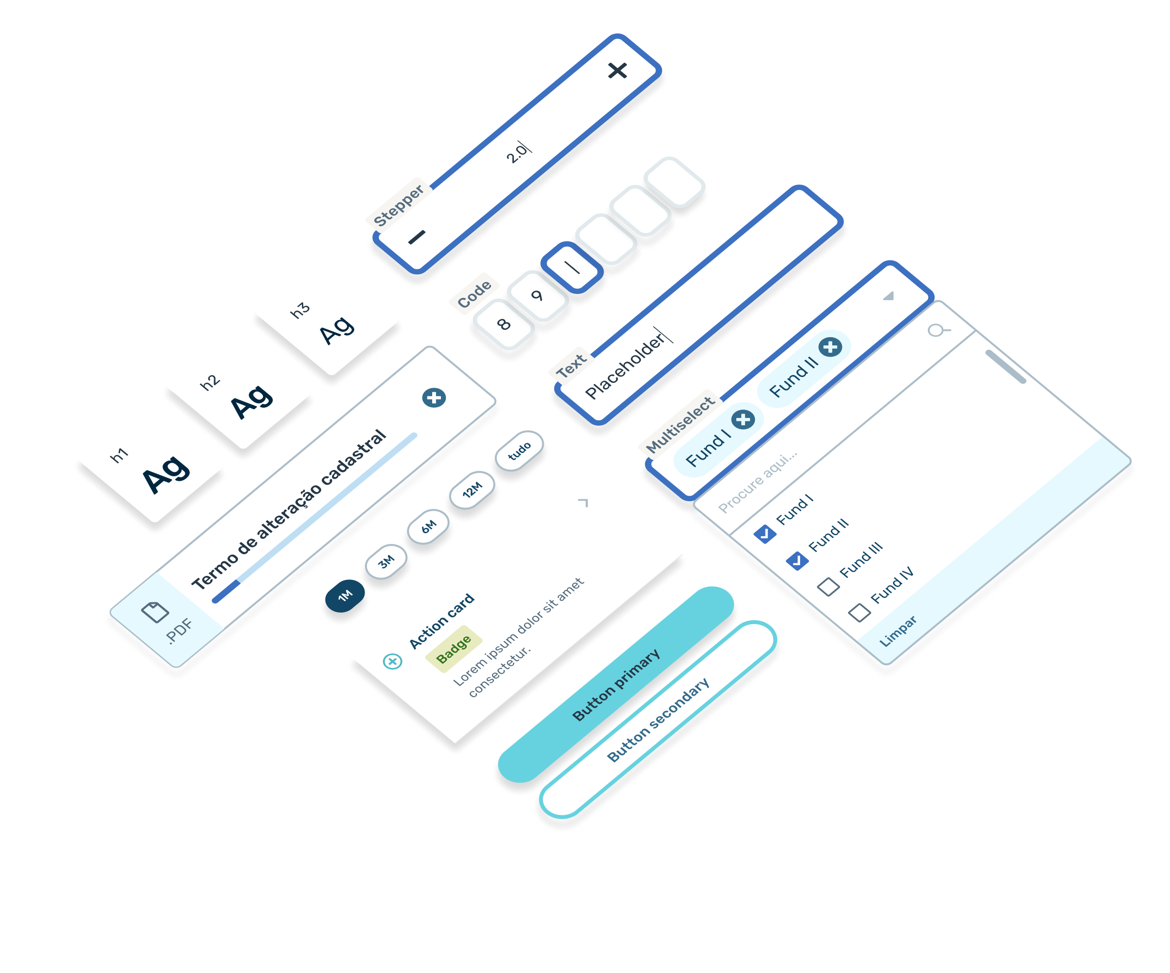
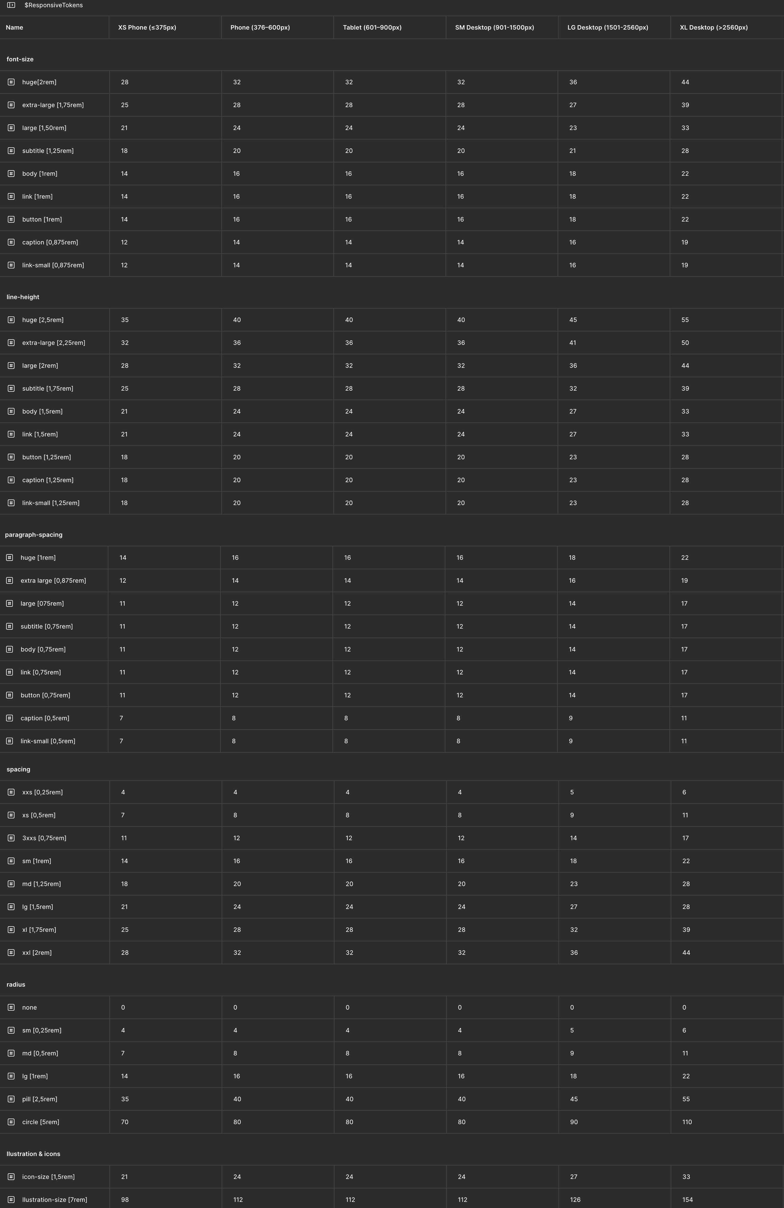
I designed the breakpoint architecture and mapped 9 typography tokens to rem values — informed by research across other design systems and refined through critique cycles with engineering.
I expanded the rem-based architecture beyond typography to spacing, icons, corner radius, and illustrations — creating one unified responsive system across the design language.
I authored the documentation and migration guide — establishing a single source of truth that designers and engineers could reference and adopt.
PROCESS
How I got there
W 1–4
Research & Alignment
W 5–10
Architecture
W 11–14
Refinement & Docs
FIGMA SETUP
Figma Variables and Modes used to simulate rem behavior — each breakpoint defines a base root size that all tokens scale from.
SOLUTION
One responsive system across breakpoints
01 · BREAKPOINT MATRIX
| BREAKPOINT | WIDTH | EXAMPLE DEVICES | 1REM |
|---|---|---|---|
| XS Phone | ≤ 375 px | iPhone 13 Mini | 14 px |
| Phone | 376 – 600 px | Pixel • Galaxy S | 16 px |
| Tablet | 601 – 900 px | iPads | 16 px |
| SM Desktop | 901 – 1500 px | Notebooks • small monitors | 16 px |
| LG Desktop | 1501 – 2560 px | Large monitors • widescreens | 18 px |
| XG Desktop | > 2560 px | HD • UHD • 4K monitors | 22 px |
02 · TOKEN MAPPING
| TOKEN | FONT SIZE | LINE HEIGHT | PARAGRAPH SPACING |
|---|---|---|---|
| Huge | 2rem | 2.50rem | 1rem |
| Extra Large | 1.75rem | 2.25rem | 0.875rem |
| Large | 1.50rem | 2rem | 0.75rem |
| Subtitle | 1.25rem | 1.75rem | 0.75rem |
| Body | 1rem | 1.50rem | 0.75rem |
| Link | 1rem | 1.50rem | 0.75rem |
| Button | 1rem | 1.25rem | 0.75rem |
| Caption | 0.875rem | 1.25rem | 0.50rem |
| Link Small | 0.875rem | 1.25rem | 0.50rem |
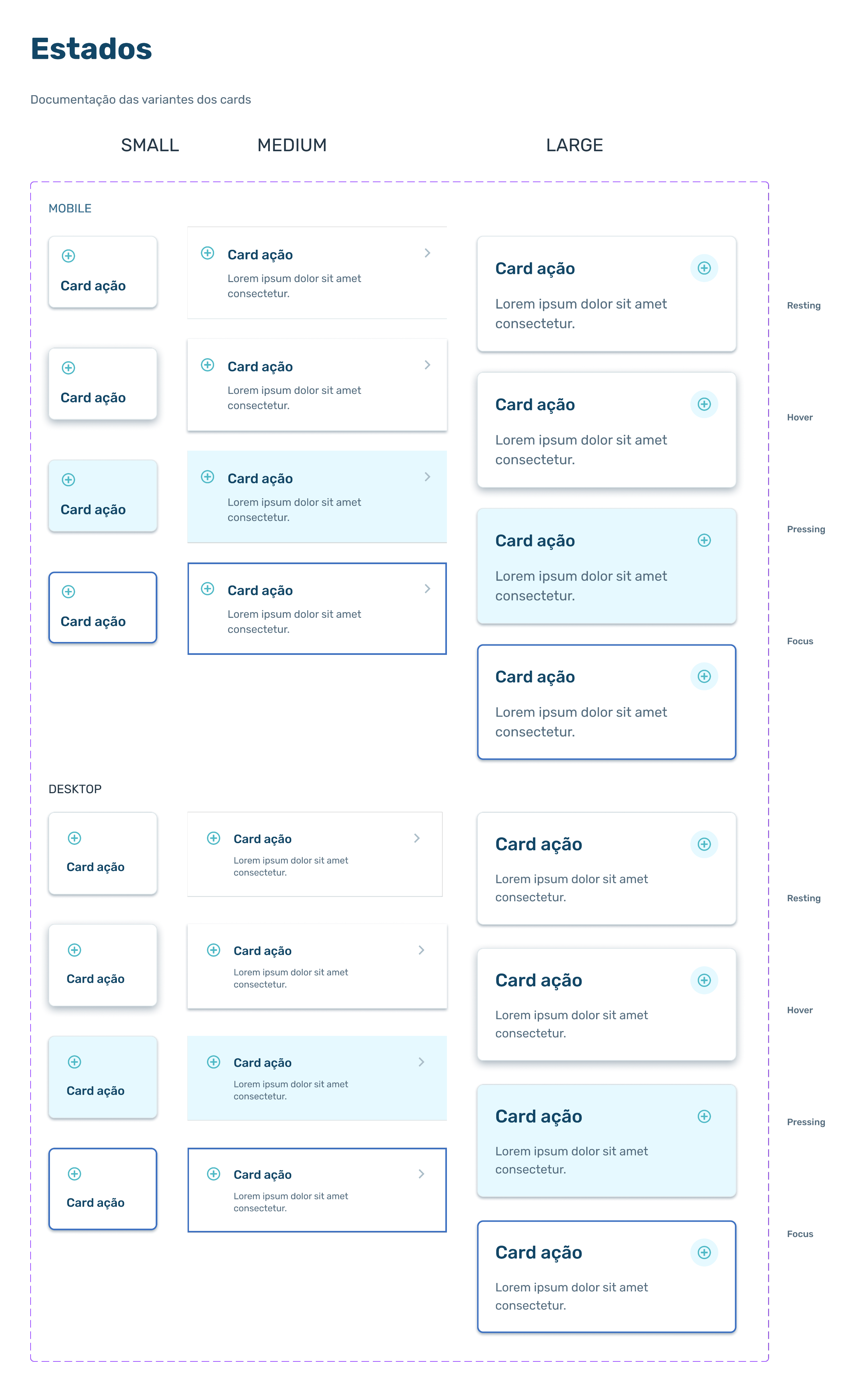
BEFORE
Card states documented twice — once for mobile, once for desktop. Every new component meant parallel documentation, doubling the maintenance burden.
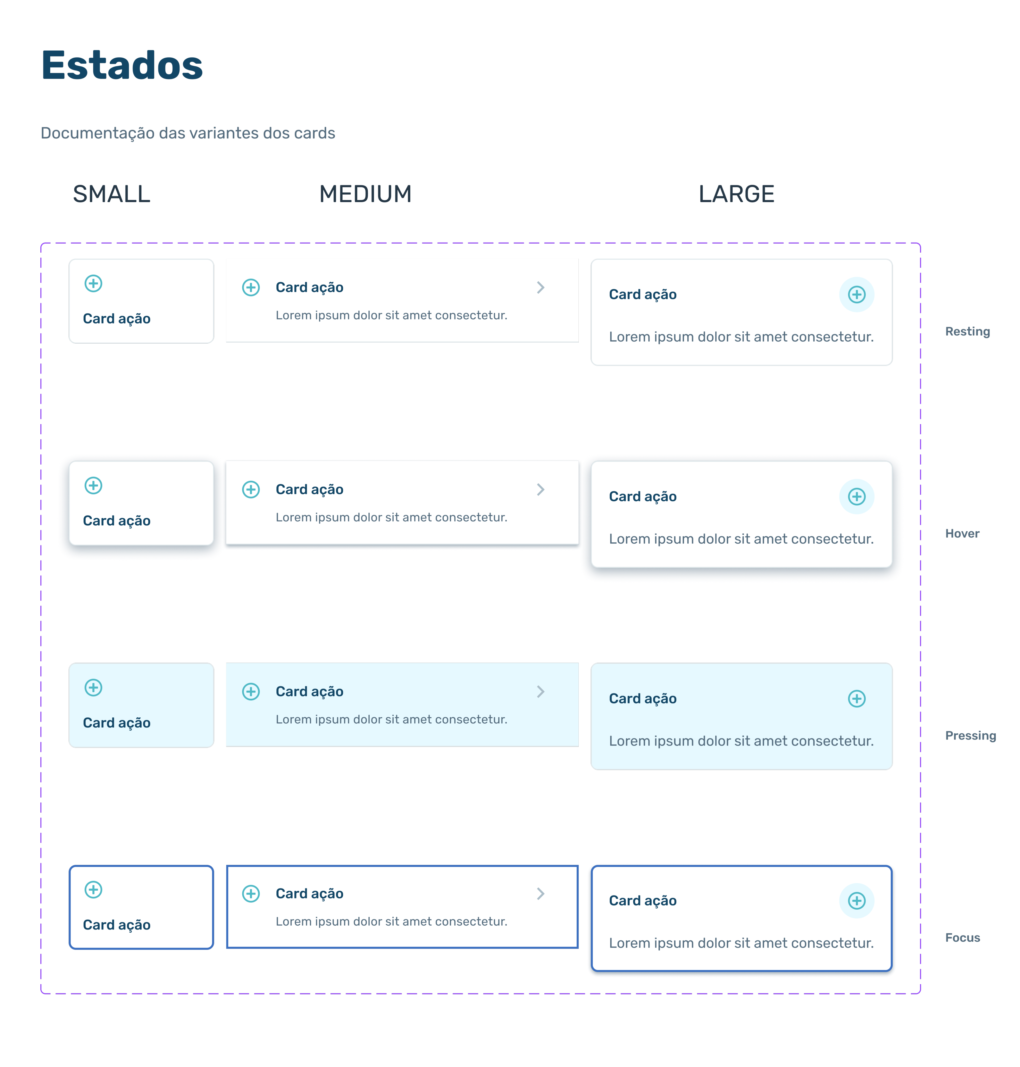
AFTER
Card states documented once. The rem-based system absorbs responsive scaling — new components no longer require parallel mobile and desktop versions.
SYSTEM IMPACT
What the new architecture enables
BREAKPOINTS
6
from XS phones (≤375px) to UHD monitors (>2560px)
TYPOGRAPHY TOKENS
9
mapped to rem values across all breakpoints
SYSTEM AREAS
5
typography • spacing • icons • radius • illustrations
BEFORE
Two rigid scales (mobile + desktop)
Components with separate mobile/desktop variants
Fragmented documentation per breakpoint
Product breakage on extreme devices customers actually used
AFTER
One unified system across 6 breakpoints
Single component definition with automatic scaling
Single source of truth for design and engineering
Consistent experience from XS phones to 4K monitors
LEARNINGS
What this taught me
Strong design systems aren't designed in isolation. The shift to rem started as a Front-End recommendation; my contribution was translating that constraint into a token architecture that scales across the entire design language — typography, spacing, icons, radius, illustrations.
Real-device behavior surfaces what theory misses. The Apple auto-zoom on small fields — flagged by Front-End during implementation — reshaped the breakpoint thresholds in a way no benchmark could have. Next time, I'd front-load device-specific testing earlier in the architecture phase rather than treating it as an edge case.
Want to dig into the token architecture or migration approach?
Happy to walk through the breakpoint reasoning and the cross-functional process behind it.
CONTINUE READING